Pixel Skies
A downloadable asset pack
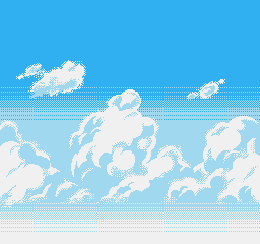
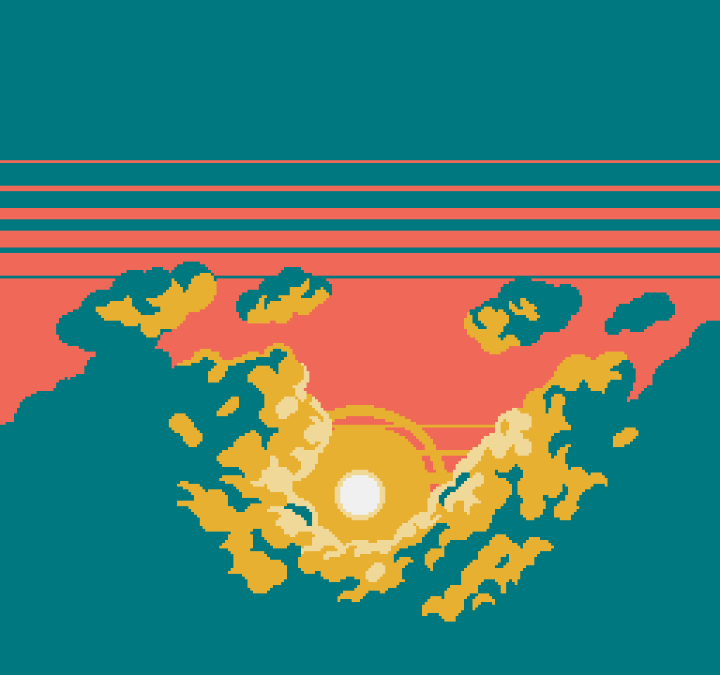
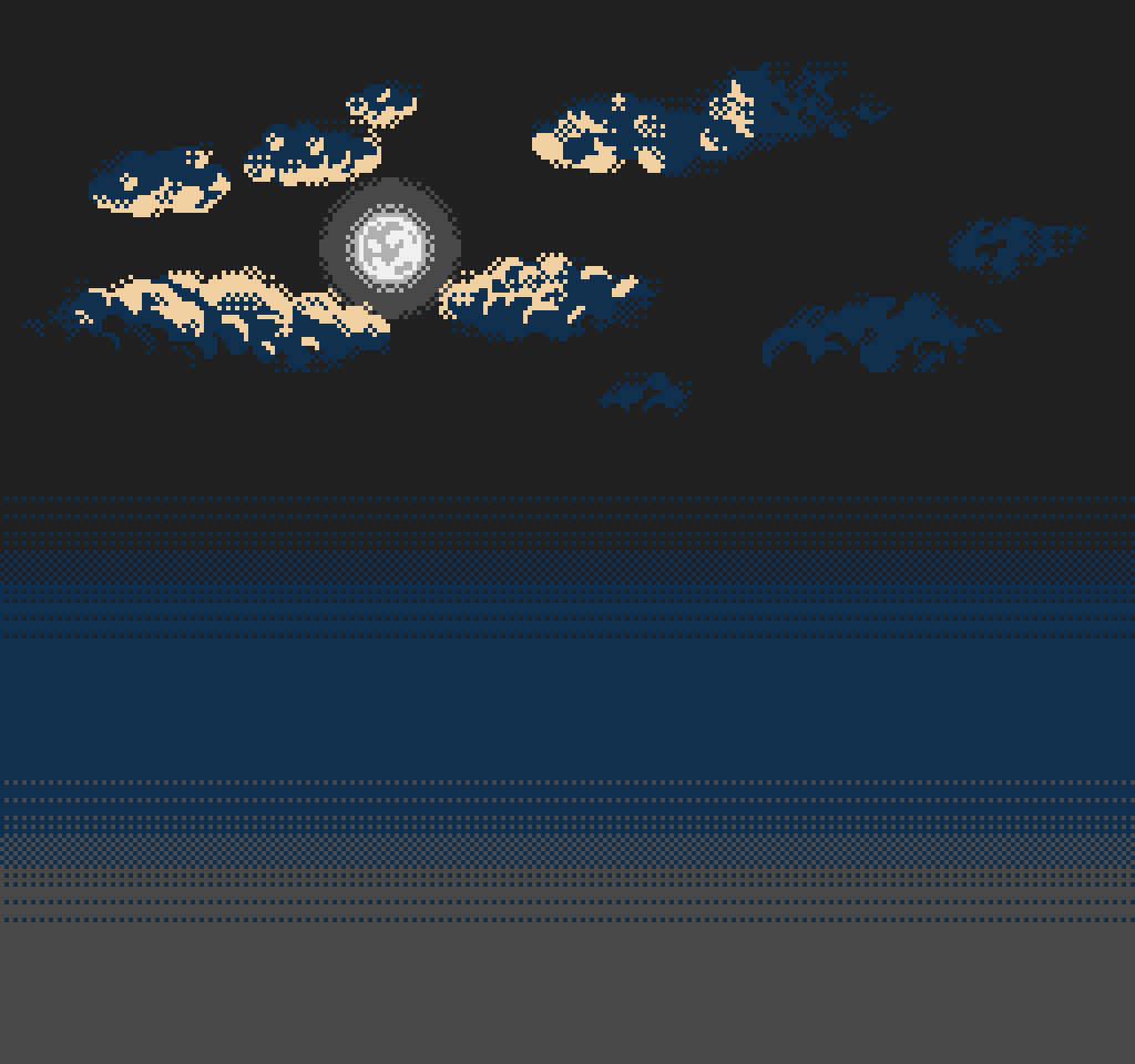
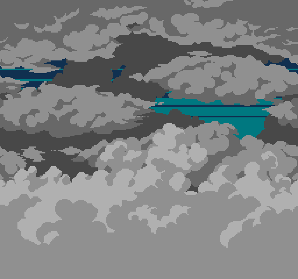
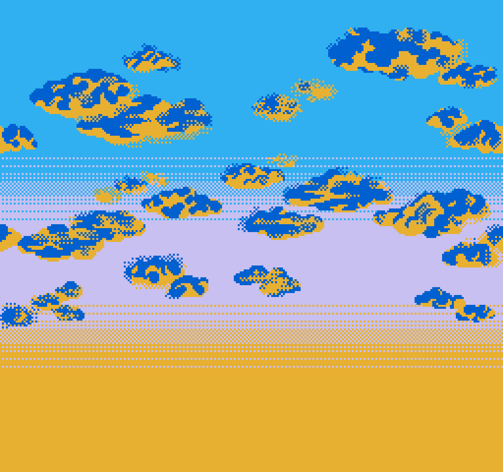
Pixel art skies with many different styles and colors. Designed with a NES-inspired aesthetic, although it also can be used in almost any pixel game which has a sky background in it.
Most of the backgrounds are seamlessly connected on both sides, allowing them to loop perfectly with a parallax effect.
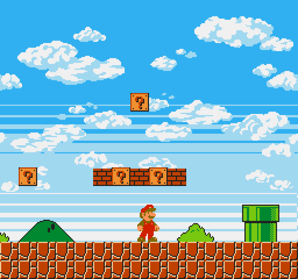
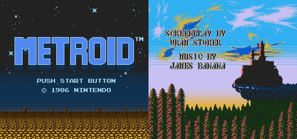
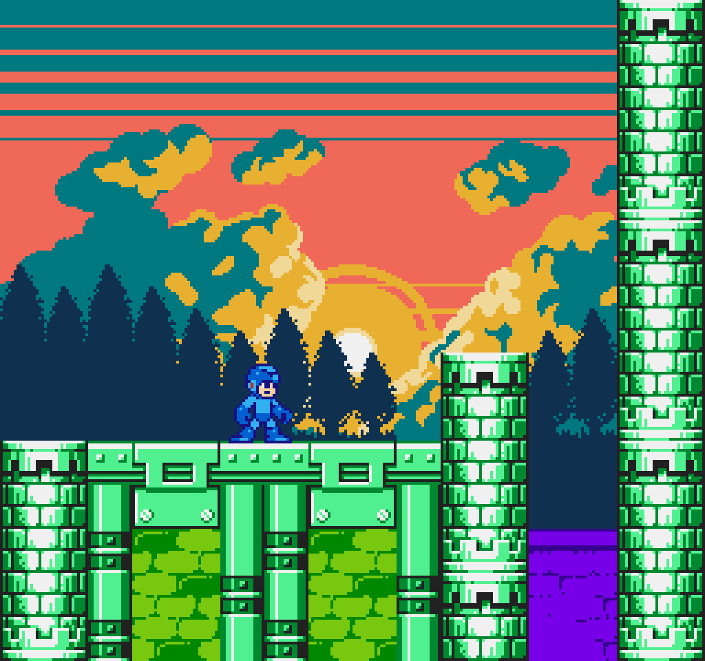
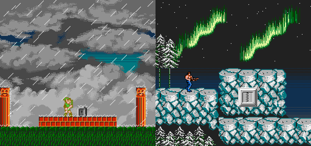
Just like in the pictures, there are several types of skies ready to use of different moments of the day cycle. Each sky comes in both sharp and a blended variant, so you can choose according to your preferences.
It also includes adittional color pallettes in case you prefer alternative tones or even make your own color pallettes.

The pack also include all the .psd files so you can easily adapt them to your liking.
Take a look at the examples of well-known games to see how a project might look when using these backgrounds.
Download
Click download now to get access to the following files:
Development log
- Additional Backgrounds57 days ago
Comments
Log in with itch.io to leave a comment.
Hi Gianqui! Thank you for the cool parallax sprites :) Used it in my game:
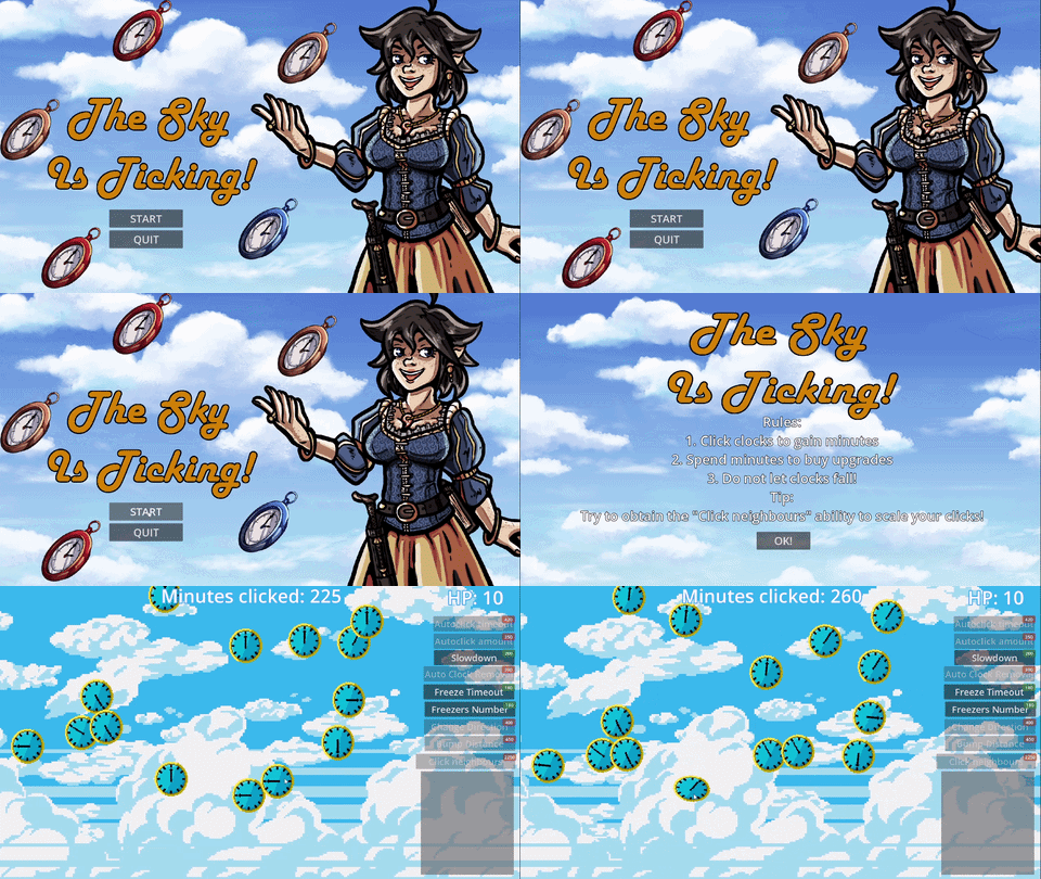
https://shypshynajam.itch.io/incremental-game-the-sky-is-ticking
This is great work, thank you very much. I'm using it for a platformer i'm working on, and i'd love to hear your thoughts about it!
oh wow these are stunning. and nostalgic!
i hope you dont mind a technical question, bc i am rather rubbish at colors - if i were to make moon phases, do you suggest a step over in hue or in reducing brightness? or both? to make the shadow. i know enough to simply keep the moonglow in place, but creating a shadow that still shows the moon's features means i'm moving the pixel colors over... somewhere. in the palette.
So glad you like it.
Answering your question, it depends on the pallete your are using. The more colors in your pallette, the more easy will be for lightning and shadowing; however i would recommend steping over your color pallete.
I share with you this example:
In both second and third row, i just reused the same colors that my pallette already have. (Of course, you can adapt it to your own pallette).
In the case i want, for example: the second row style but the shadow to be more darker. Beacuse that's the most "dark gray" that my pallette have, i would need to add that new color to my pallete and "reorganize my pallette".
Hope you find this answer helpful!
Regards.